
The Extended Color Wheel by Itten
I was recently done reading “Kunst der Farbe” (Art of Color) by Johannes Itten. In this book, the great master of the Bauhaus exposes his theory about color and its role in artistic compositions. Itten makes the distinction between 7 kinds of contrast and shows the discrepancies between the objective physical properties of colors and our subjective perception. Itten introduces the 12-part color wheel to represent the visible spectrum of light.
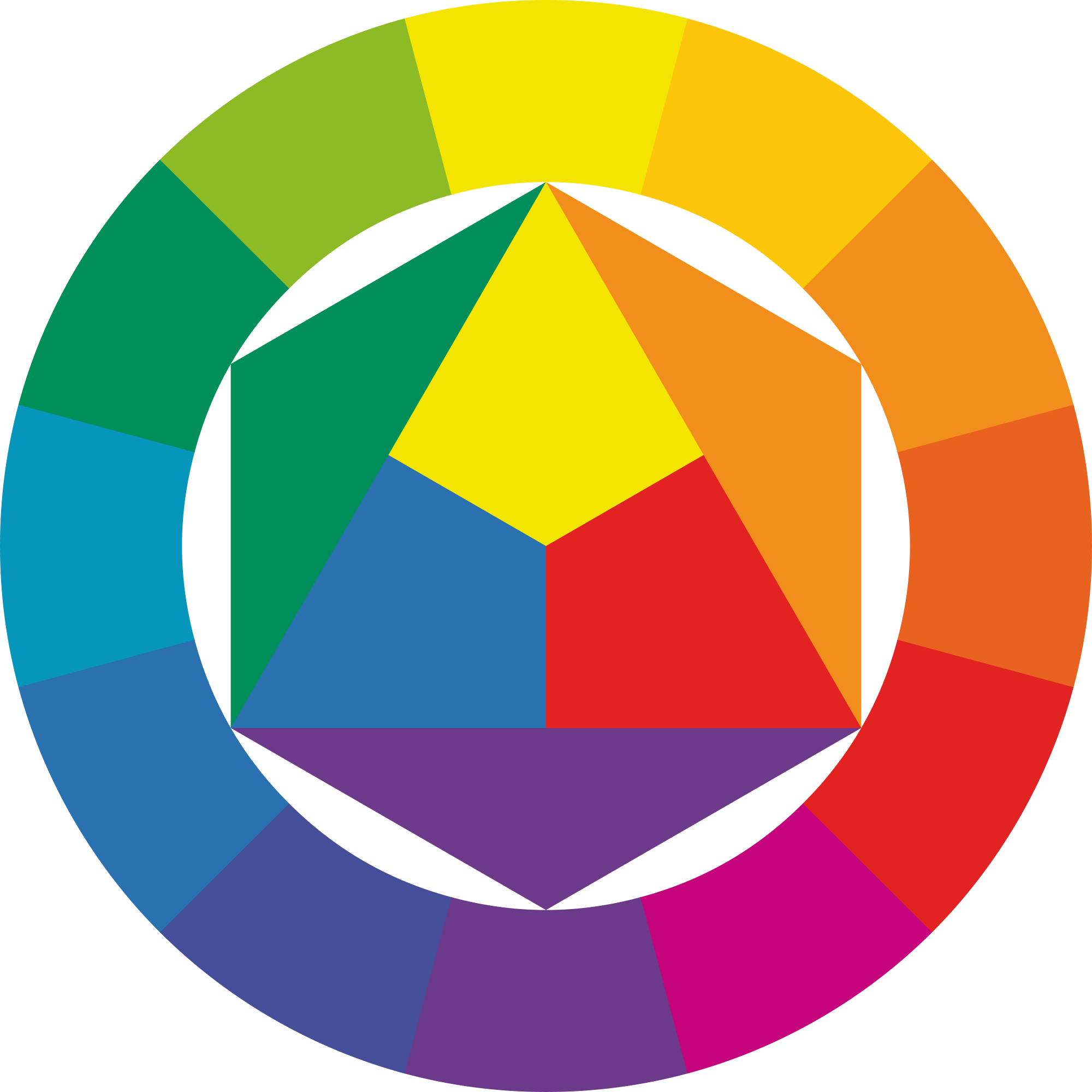
This representation is particularly interesting. In the center are the first-order colors: blue, yellow, red. Then, the second-order colors green, orange, violet are obtained by mixing respectively the first-order colors blue-yellow, yellow-red, red-blue. On the ring are the third-order colors which are a blend of first-order color with second-order colors. For each color, by drawing a straight line that goes through the center, you will get the complementary color on the other side of the wheel.
If you fit a regular shape in the wheel, such as a square, rectangle, or equilateral triangle, the color that you will get at the apexes are harmonious, i.e. they “go well” together.
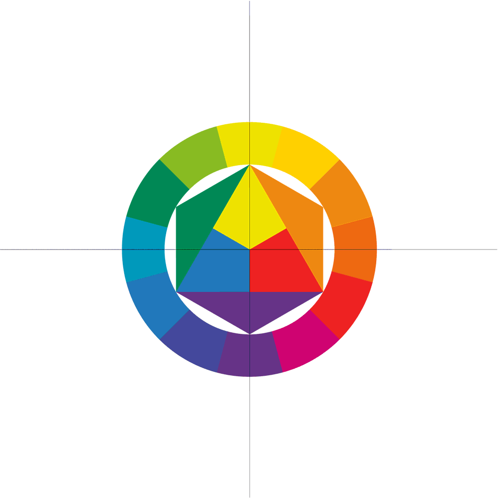
I found the principle very interesting, so I decided to extend the wheel by adding a ring containing the “fourth-order” colors, i.e. a mix of the third-order colors with the first or second-order colors. So we move from a 12-color representation to a 24-color representation. It looks like this:

I have documented the different steps of the creation of this image on Photoshop, as a GIF:
Itten said that such an extension would be useless and that artists just need to know the 12-part color wheel very well. Still, I like the result. In my opinion, the level of detail between the different orders can be best visualized this way:
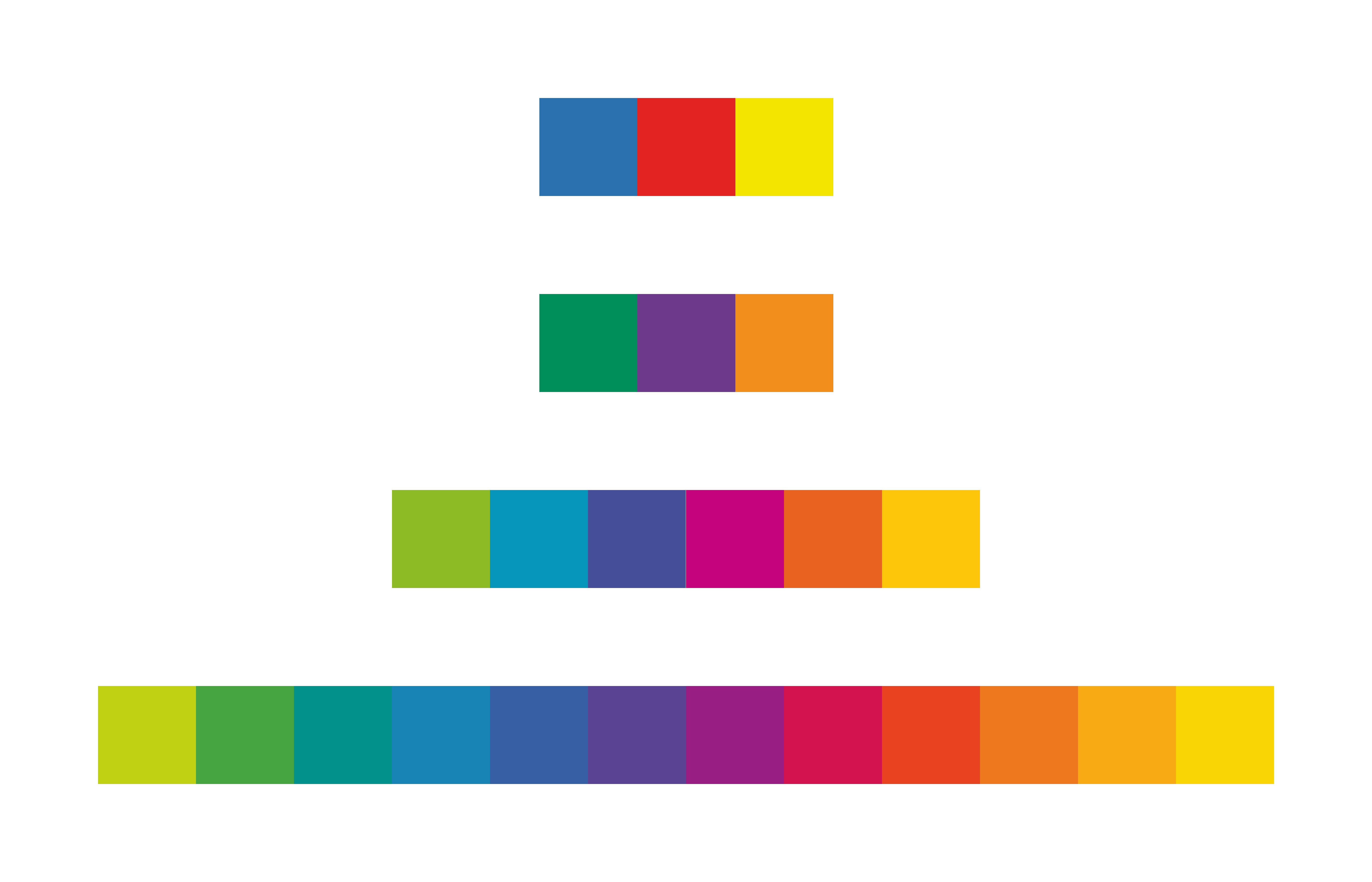
The first line are the first-order colors, the second line are the second-order colors, and so on… One can see a clear difference between each level. By looking at higher-order colors, contrast becomes softer and the colors can approximate the visible light spectrum with higher fidelity. Interestingly, there is just as much second-order colors as first-order colors, but still one can feel a clear difference of contrast.
Itten said that everyone has its specific subjective color chord. He could say a lot about the personality of someone just by looking at those colors. Here is my subjective color chord:

What would be yours? :)
